How We Train ML Models
All supervised ML training follows the same loop:
- Choose a model (e.g., linear, polynomial, neural network)
- Define a loss function that measures error
- Adjust parameters to minimise this error
The goal is to find the parameters that gives good predictions on unseen data.
Loss Function
The loss function quantifies how bad the model’s predictions are. Examples include mean squared error and cross entropy.
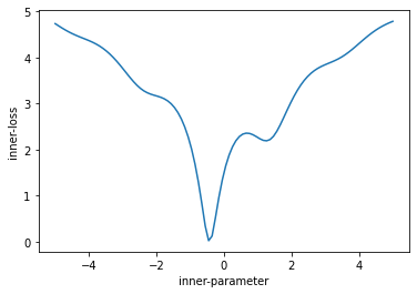
We want to minimize this loss function and hence make good predictions.
Gradient Descent
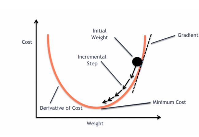
We update weights w by moving in the direction that reduces the loss.
\[ w \leftarrow w - \eta \, \nabla_w J(w) \]
Repeated updates → parameters that minimise the loss.
Loss Function
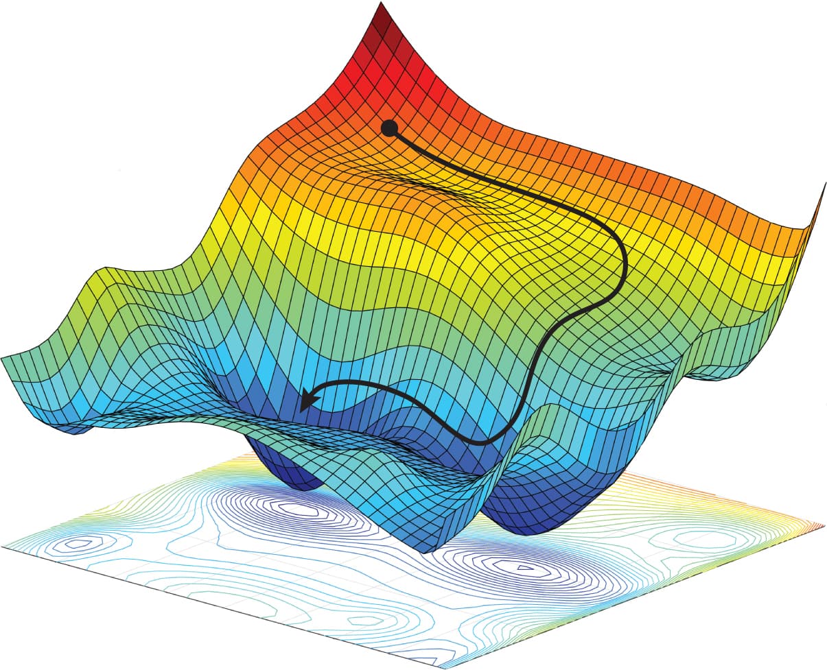
We can visualize the loss function in 2D easily but n-dimensional is a little harder to imagine!
Loss Curves
In an ideal world as we update our model / take gradient descent steps the loss reduces.
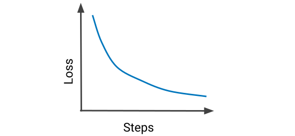
However if we keep training forever, with a sufficiently complex model, eventually we could fit every training example.
How We Train and Evaluate ML Models
All supervised ML training follows the same loop:
- Choose a model (e.g., linear, polynomial, neural network)
- Define a loss function that measures error
- Adjust parameters to minimise this error
The goal is to find the parameters that gives good predictions on unseen data.
- What is a good prediction?
- We can score highly on arbitrary accuracy percentages with trivial models - is this actually useful in the real-world?
- If 99.9% of mail is not-spam I can make a 99.9% accurate spam detector by classifying everything as not-spam.
Loss Curves
Is this a good fit of a descision boundary?

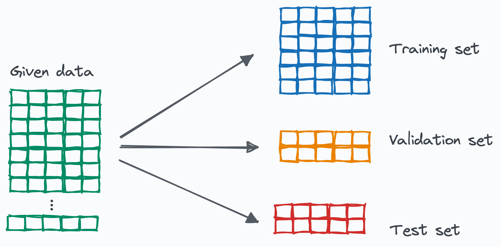
Training/Validation/Test Sets
We need to reserve some data to test out model.
- Training Set: Used to fit the model.
- Validation Set: Used to tune hyperparameters like \( \lambda \).
- Test Set: Used to assess the model's performance on unseen data.
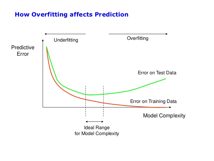
Loss Curves
As we keep increasing model complexity eventually we perform worse on the test data.
Train, Validation and Test split
How to split into train, validation and test?
What type of errors are we making?
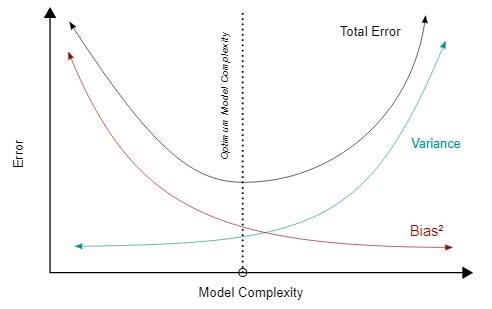
Bias and Variance
In machine learning, the terms bias and variance help us understand the types of errors that can arise during model training and prediction.
Bias measures how well the model approximates the true relationship between features and the label. It is defined as the difference between the expected prediction of the model and the actual value we aim to predict.
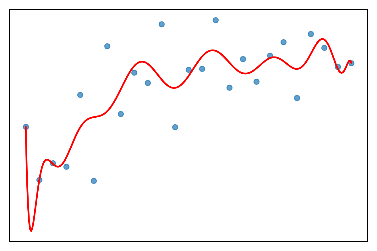
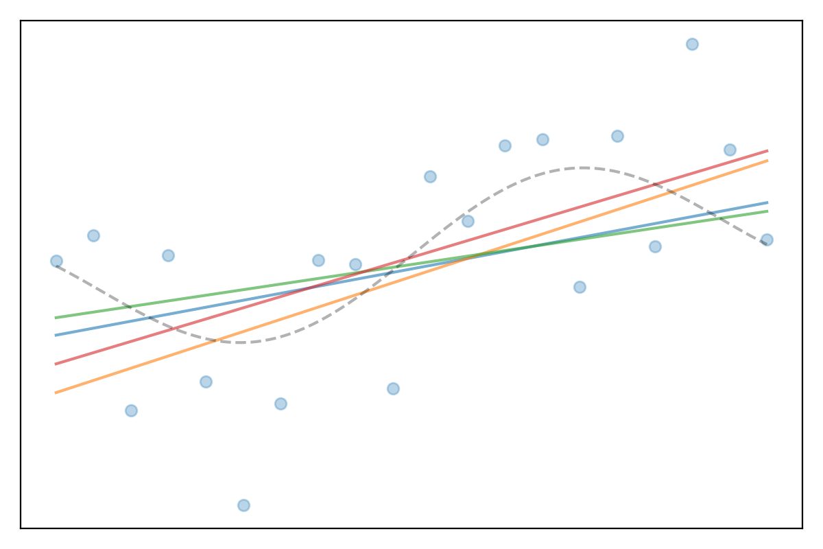
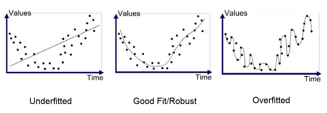
High bias indicates an overly simplistic model that does not capture the complexity of the data well, leading to underfitting.
Variance, on the other hand, measures the sensitivity of the model to variations in the training data. A model with high variance pays too much attention to the training data and may not generalize well to unseen data, leading to overfitting.
The Bias-Variance Tradeoff describes the challenge of finding a balance between bias and variance to minimize the overall error of the model.
Model error can be decomposed as:
$$ \text{Total Error} = \text{Bias}^2 + \text{Variance} + \text{Irreducible Error} $$Bias is the error introduced by approximating a real-world problem, which may be complex, with a simplified model. Variance is the error introduced by excessive sensitivity to small fluctuations in the training data. The irreducible error is noise that cannot be eliminated, regardless of the model chosen.
Bias-Variance Tradeoff
Regularisation (last week) introduces bias into the model but reduces variance:
- High Bias: Oversimplified model, underfitting.
- High Variance: Complex model, overfitting.
Regularisation helps find a balance between bias and variance.
Question: What kind of model error is this?
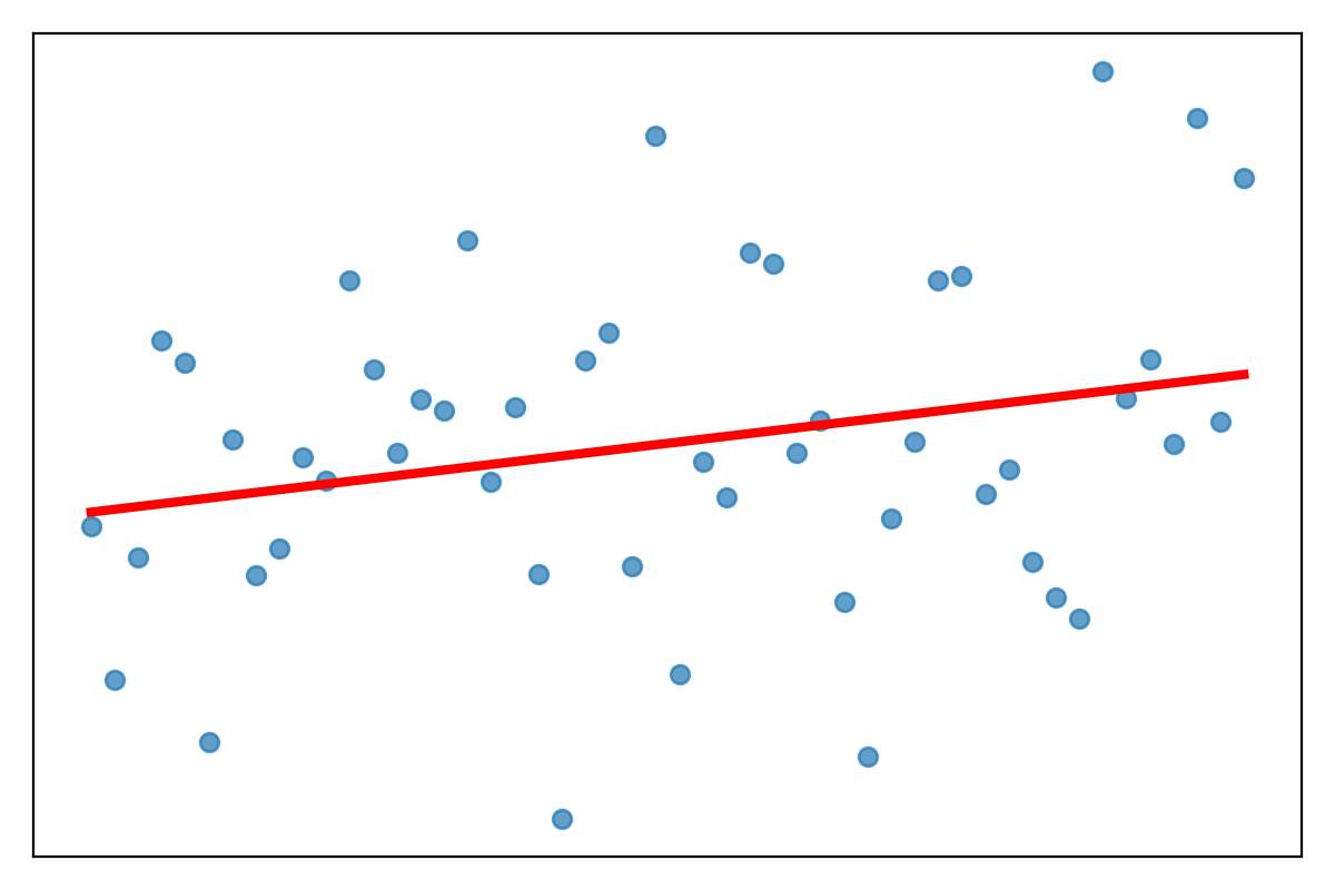
- High bias?
- High variance?
- Both?
Question: What kind of model error is this?
- High bias?
- High variance?
- Both?
Question: What kind of model error is this?
- High bias?
- High variance?
- Both?
Question: What kind of model error is this?
- High bias?
- High variance?
- Both?
Question: What kind of model error is this?
- High bias?
- High variance?
- Both?
Question: What kind of model error is this?
- High bias?
- High variance?
- Both?
When tuning model complexity:
- A simple model typically has high bias and low variance. It fails to capture the underlying patterns, resulting in high training and testing error (underfitting).
- A complex model typically has low bias but high variance. It captures noise from the training data, leading to low training error but high testing error (overfitting).
The goal of model training is to achieve the optimal balance, minimizing both bias and variance to reduce the total error.
What kinds of errors can we make?
Even with the same overall accuracy, models can make different kinds of mistakes:
- Predict positive when the truth is negative
- Predict negative when the truth is positive
These two error types can have very different real-world consequences.
Two types of mistakes
| True positive | True negative | |
|---|---|---|
| Model says positive | ✅ Correct: true positive (TP) | ❌ False positive (FP) |
| Model says negative | ❌ False negative (FN) | ✅ Correct: true negative (TN) |
In statistics: FP ≈ “Type I error”, FN ≈ “Type II error”.
Which error is worse?
Example: binary classifier for breast cancer screening.
- False positive: tell a healthy person they might have cancer
- ⇒ extra tests, anxiety, possible unnecessary procedures
- False negative: miss a real cancer case
- ⇒ delayed diagnosis, worse outcomes
Question: which error should the system try hardest to avoid?
In medical screening, we often prefer “too many alarms” (FP) over missed cases (FN).
We therefore need tools to explore this trade-off as we change the threshold.
Same accuracy, different harms
Two cancer classifiers might have the same overall accuracy, but:
- Model A: more false positives, fewer false negatives
- Model B: fewer false positives, more false negatives
Which model would be better for cancer diagnosis?
Model A has few false negatives
Thresholds and trade-offs
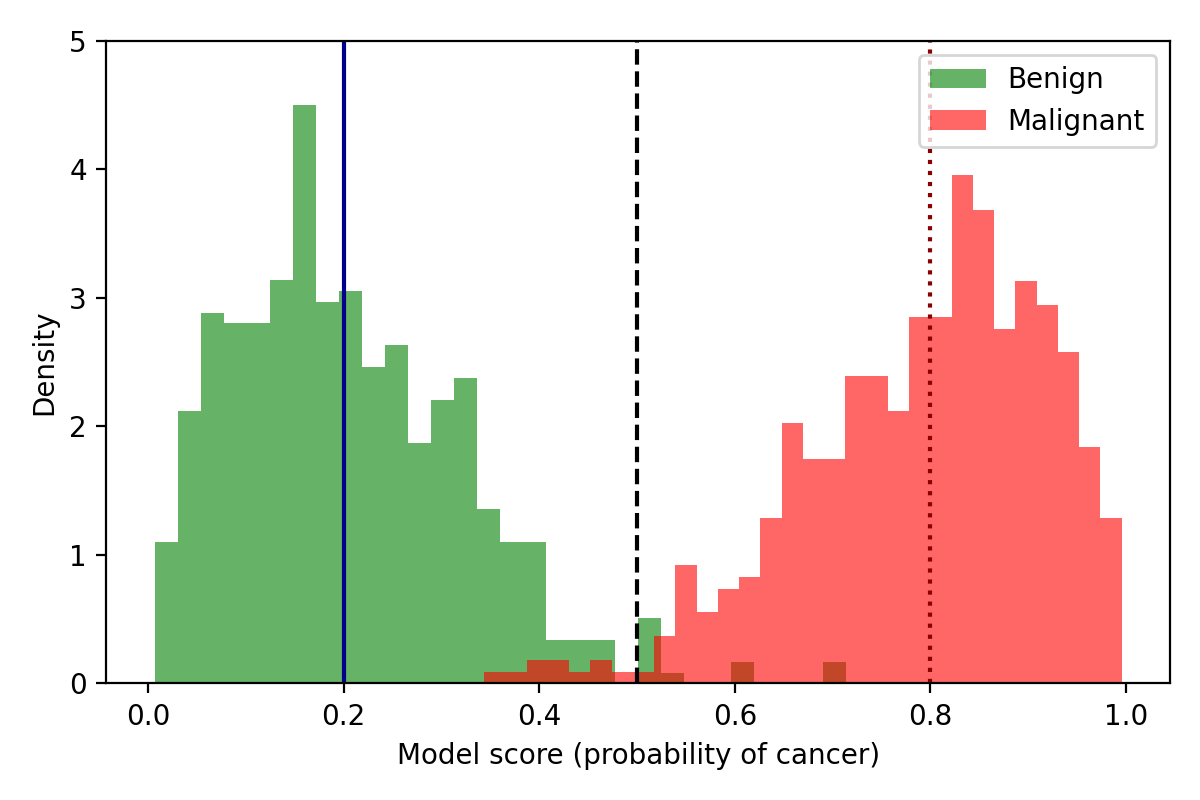
Most classifiers output a score or probability, not just yes/no.
- In medicine we often prioritise avoiding FN (missing disease).
- But decisions (e.g., breast-cancer surgery) reflect probabilistic risk, not certainties.
- High FN-aversion can push patients/clinicians toward aggressive action even at low predicted risk.
- Threshold choice encodes these preferences → different patients may choose different points.
- We choose a threshold: above it → predict positive, below it → predict negative.
- Moving the threshold changes the balance of FP and FN.
Motivating example: cancer screening
Suppose we use a classifier to decide whether a tumour is benign or malignant.
- Input: features from an image or biopsy (size, texture, etc.).
- Output: a score between 0 and 1 = “model’s confidence of cancer”.
- Decision: if score ≥ threshold → send patient for further investigation.
Small changes to the threshold can change who gets a scan, surgery, or is sent home.
Small changes to the threshold can change who gets a scan, surgery, or is sent home.
Quality metrics
- the performance of a binary classifier can be described by the confusion matrix
| true value is positive | true value is negative | |
|---|---|---|
| predicted positive | true positive TP | false positive FP |
| predicted negative | false negative FN | True negative TN |
- From this matrix we can define several metrics to quantify the quality of the classification.
$\mbox{true positive rate}=\frac{TP}{TP+FN}$
and
$\mbox{false positive rate}=\frac{FP}{FP+TN}$
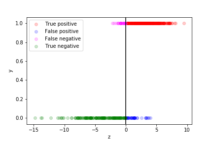
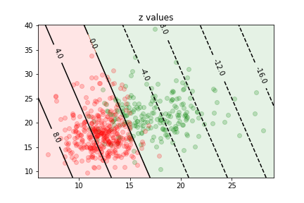
we can see how well the prediction works by plotting the true value as a function of $z$ for each data point in the training sample:
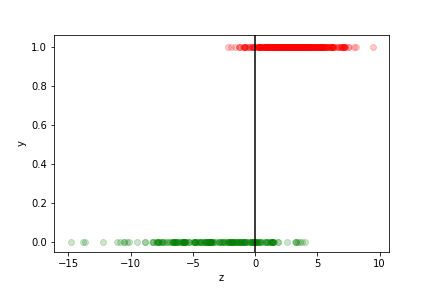
- The points with $z>0$ are assigned to the $y=1$ class
- they correspond to $p>\frac12$
- those with $z<0$ to the $y=0$ class
- they correspond to $p<\frac12$
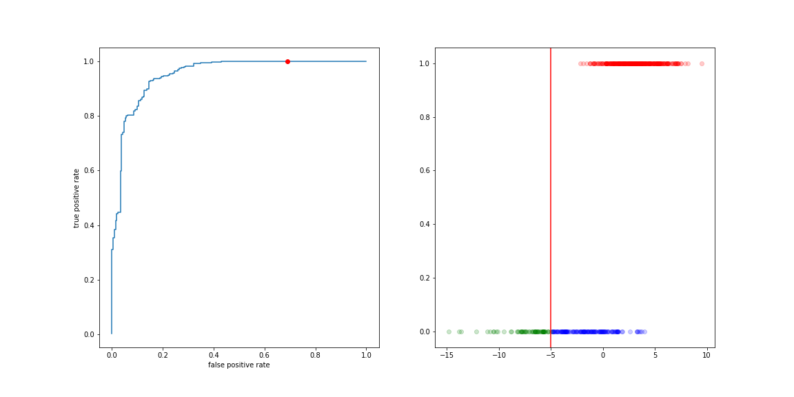
The different categories (TP, FP, TN, FN) can be visualised on this plot:
If we are more worried about false negative than about false positive, we can move the decision boundary to the left:
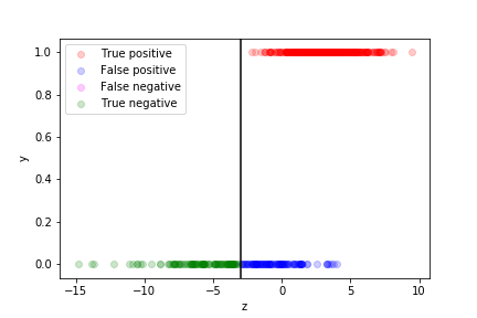
Of course if means more false positives...
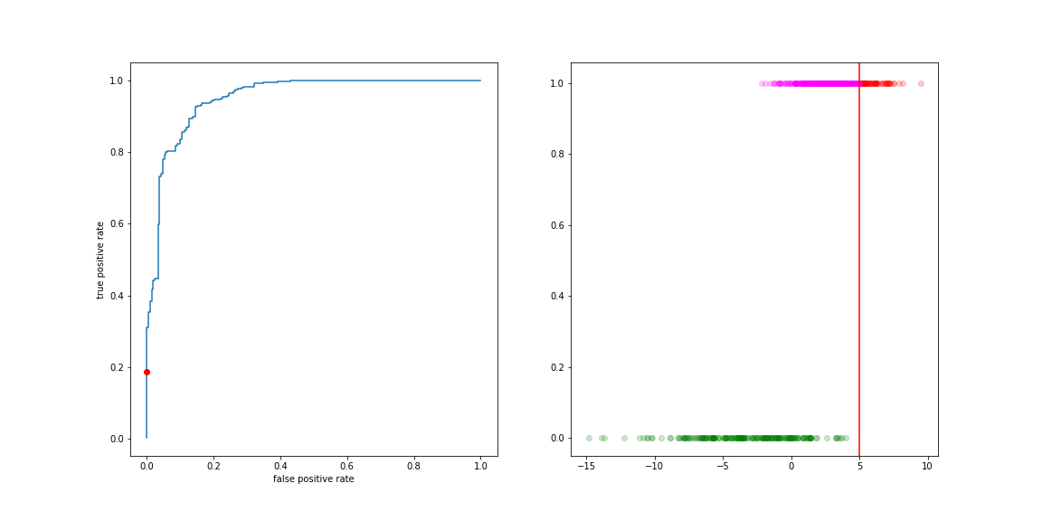
If we are more worried about false positive than about false negative, we can move the decision boundary to the right:
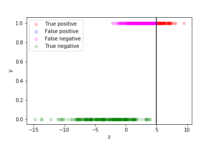
Of course if means more false negatives...
The curve describing this trade-off is the ROC curve (Receiver Operating Characteristic). It is the collection of (FP rate, TP rate) values for all values of the decision boundary.
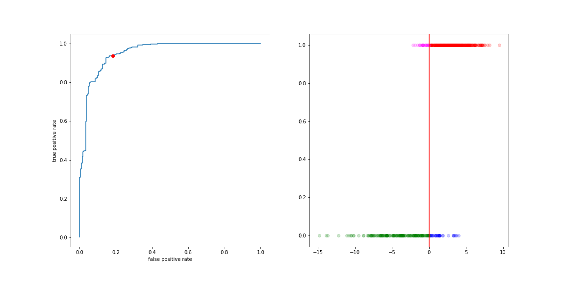
Move the threshold to the left:
- more true positives
- more false positive
Move the threshold to the right:
- less true positives
- less false positive
Reading a ROC curve
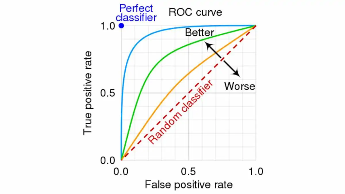
ROC curve axes:
- x-axis: False Positive Rate (FPR)
- y-axis: True Positive Rate (TPR, sensitivity, recall)
- Diagonal line = random guessing
- Better models push the curve towards the top-left corner
Reading a ROC curve
Area Under the ROC Curve (AUC)
AUC = area under the ROC curve.
- Ranges from 0.5 (random) to 1.0 (perfect).
- Interpretation: probability that a randomly chosen positive is ranked higher than a randomly chosen negative.
AUC = 0.90 means “in 90% of positive–negative pairs, the model gives a higher score to the positive case”.
Area Under the ROC Curve (AUC)

Comparing models with ROC/AUC
We can plot multiple ROC curves on the same axes:
- Curve closer to top-left is usually better.
- Higher AUC is usually preferred.
- But the best threshold still depends on the application’s costs (FP vs FN).
Choosing an operating point
Each point on the ROC curve corresponds to a particular threshold:
- For cancer screening, we might choose a point with very high TPR (few missed cancers), accepting more FPs.
- For spam filtering, we might accept more FN (some spam in inbox) to avoid many FPs (important emails in spam).
The ROC curve does not tell us “the” correct threshold, but helps us choose one.
ROC curves and class imbalance
ROC curves are insensitive to class imbalance:
- They treat positives and negatives symmetrically via TPR and FPR.
- When positives are very rare, ROC can look good even if we have many false positives.
For very imbalanced data, Precision–Recall curves can be more informative.
Precision-Recall curves
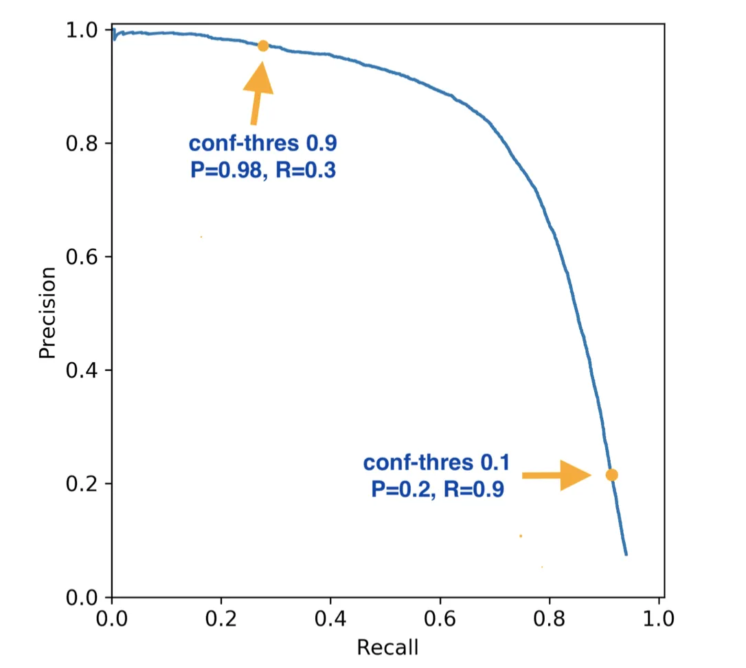
Precision-Recall (PR) curve:
- x-axis: Recall (TPR)
- y-axis: Precision = TP / (TP + FP)
Focuses only on the positive class, useful when positives are rare (e.g. disease, fraud).
Same idea as ROC: sweep the threshold, plot (Recall, Precision).
Why Precision-Recall curves?
ROC curves treat positives and negatives symmetrically.
But when positives are rare (e.g., cancer, fraud):
- Precision tells us: “Of all predicted positives, how many are actually positive?”
- Recall tells us: “Of all actual positives, how many did we find?”
Precision-Recall curves focus on the positive class directly.
Precision-Recall curves
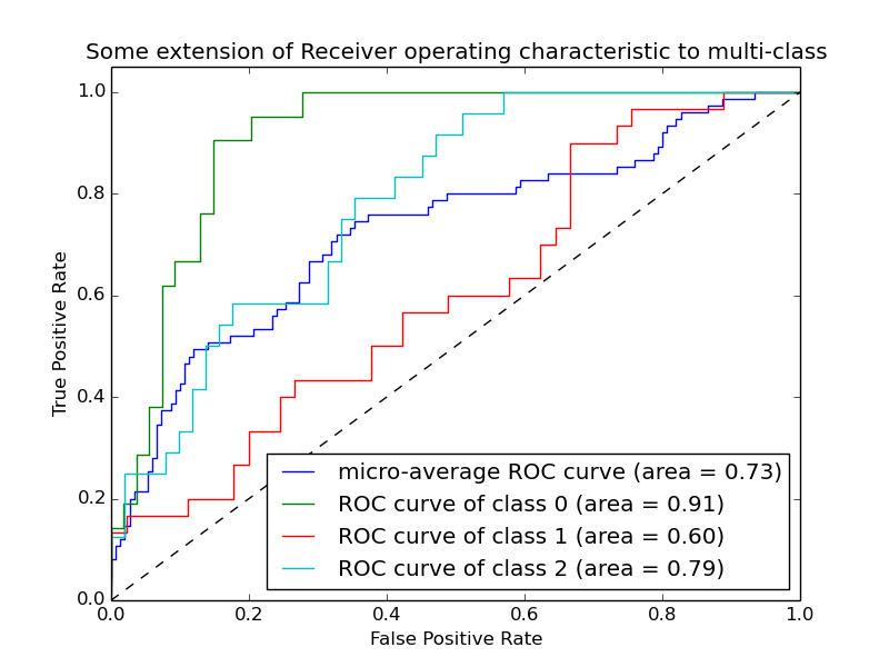
Multi-class ROC
For more than two classes, ROC is usually extended via:
- One-vs-rest: treat each class as “positive” vs all others as “negative”.
- Compute an ROC curve and AUC for each class.
- Report macro/micro-average AUC across classes.
Still the same idea of comparing scores for positives vs negatives.
Multi-class ROC
Support Vector Machines
Support Vector Machines are a powerful and versatile Machine Learning tool used for both classification and regression tasks. They are particularly well-suited for problems where the data is high-dimensional and the number of features exceeds the number of samples.
Key Features of SVM
- Versatility: Applicable to both classification and regression problems.
- Flexibility: Can model linear and non-linear relationships using kernel functions.
- Robustness: Effective in high-dimensional spaces and when the number of dimensions exceeds the number of samples.
Binary Classification with SVM
We focus on a binary classification problem where the labels are \( y = +1 \) for positive class and \( y = -1 \) for negative class.
Objective
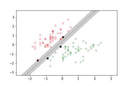
The goal of an SVM is to find the hyperplane that best separates the two classes by maximizing the margin, which is the minimal distance between the data points and the decision boundary.
Types of Margin Classification
Hard Margin Classification
- Definition: No data points are allowed within the margin; all points must be correctly classified without errors.
- Characteristics:
- Only works if the data is linearly separable.
- Sensitive to outliers; a single misclassified point can make the dataset non-separable.
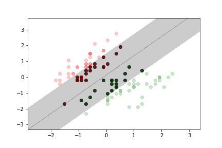
Soft Margin Classification
- Definition: Allows some data points to be within the margin or even misclassified.
- Characteristics:
- Introduces a trade-off between maximizing the margin and minimizing classification errors.
- Less sensitive to outliers compared to hard margin classification.
Mathematical Formulation
Linear SVM
For a linear model, the decision function is:
\[ z = w_0 + \vec{x} \cdot \vec{w} \]
- \( \vec{x} \): Input feature vector.
- \( \vec{w} \): Weight vector.
- \( w_0 \): Bias term.
The distance \( d \) from a point \( \vec{x} \) to the decision boundary \( z = 0 \) is proportional to \( z \):
\[ d = \frac{z}{\lVert \vec{w} \rVert} \]
- \( \lVert \vec{w} \rVert = \sqrt{\sum_{i=1}^{n} w_i^2} \): Euclidean norm of the weight vector.
Linear SVM
Margin Maximization
The SVM optimization problem aims to:
- Maximize the margin \( \frac{2}{\lVert \vec{w} \rVert} \).
- Minimize the classification error.
These two goals are in conflict and are balanced using optimization techniques.
Hard Margin Optimization Problem
\[ \begin{aligned} & \text{Minimize} && \frac{1}{2} \lVert \vec{w} \rVert^2 \\ & \text{Subject to} && y^{(i)} (w_0 + \vec{x}^{(i)} \cdot \vec{w}) \geq 1 \quad \forall i \end{aligned} \]
Soft Margin Optimization Problem
Introduces slack variables \( \xi^{(i)} \) to allow margin violations:
\[ \begin{aligned} & \text{Minimize} && \frac{1}{2} \lVert \vec{w} \rVert^2 + C \sum_{i} \xi^{(i)} \\ & \text{Subject to} && y^{(i)} (w_0 + \vec{x}^{(i)} \cdot \vec{w}) \geq 1 - \xi^{(i)}, \quad \xi^{(i)} \geq 0 \quad \forall i \end{aligned} \]
- \( C \): Regularization parameter controlling the trade-off between margin width and classification error.
Support vector machine
The loss for the SVM also uses the hinge function, but offset such that we penalise values up to 1:
$$ J(w) = \frac{1}{2}\vec w\cdot \vec w + C \sum h_1( y_i p(x_i,w)) $$where $p(x_i,w)$ is the model prediction $\vec x\cdot \vec w + w_0$ and $h_1$ is the shifted hinge function.
$$ h_1(x) = \max(0, 1- x).$$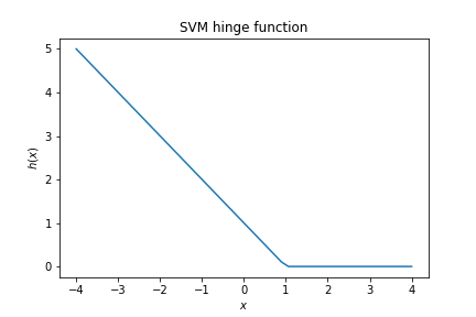
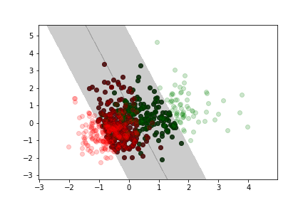
$C$ is a model parameter controlling the trade-off between the width of the margin and the amount of margin violation.
Example
Here we use the iris dataset again, but we rescaled the features so that they have 0 mean and unit standard deviation.
no margin violation
moderate margin violation
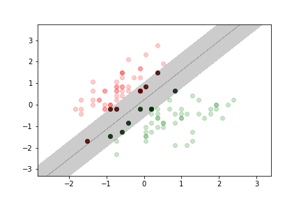
more margin violation
Non separable example
Here we use the cancer data set we used for previous lectures and exercises.
Less margin violation
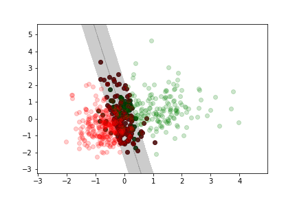
Moderate margin violation
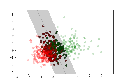
More margin violation
Training a SVM
Adding data to the training set only affects the model if the additional point falls into the margin.
The model is completely defined by the data samples at the boundary or inside the margin (this is where the name comes from, these data samples are the "support" vectors)
Note: Unlike in the logisitic regression case, there is no probabilistic interpretation for a SVM.
Reserve Slides
Overfitting and Regularisation
Overfitting occurs when a model learns the noise in the training data to the detriment of its performance on new data. Regularisation helps to mitigate overfitting by adding a complexity penalty to the loss function.
Regularised Loss Function
We modify the loss function to include a penalty term:
\[ J_{\text{pen}}(X, y, \vec{w}) = J(X, y, \vec{w}) + \lambda \cdot \text{Penalty}(\vec{w}) \]
- \( J(X, y, \vec{w}) \): Original loss function (e.g., Mean Squared Error).
- \( \lambda \): Regularisation parameter controlling the strength of the penalty.
- \( \text{Penalty}(\vec{w}) \): Function penalising large weights.
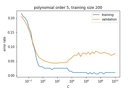
Small values of \( \lambda \) mean weak regularisation, large values of \( \lambda \) mean strong regularisation.
Types of Regularisation
- L1 Regularisation (Lasso):
- Penalty: \( \lambda \sum_{i} |w_i| \)
- Encourages sparsity (many weights become zero).
- L2 Regularisation (Ridge):
- Penalty: \( \lambda \sum_{i} w_i^2 \)
- Encourages smaller weights but doesn't force them to zero.
- Elastic Net:
- Combination of L1 and L2 penalties.
- Penalty: \( \lambda_1 \sum_{i} |w_i| + \lambda_2 \sum_{i} w_i^2 \)
1D Regression Example
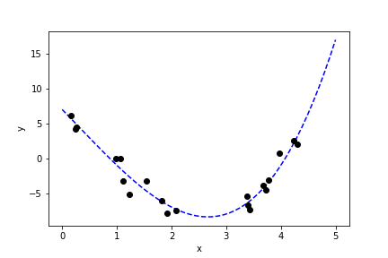
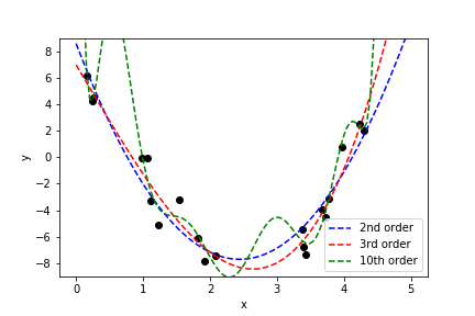
We now look at a one-dimensional example. Suppose we have the relationship:
\[ y = 7 - 8x - \frac{1}{2} x^2 + \frac{1}{2} x^3 + \epsilon \]
- \( \epsilon \): Gaussian noise with mean 0 and unit variance.
Polynomial Fitting
We fit the data using polynomials of different orders \( k \):
\[ p_w(x) = \sum_{i=0}^{k} w_i x^i \]
The loss function to minimise is the Mean Squared Error (MSE):
\[ J(x, y, \vec{w}) = \sum_{i} \left( p_w(x^{(i)}) - y^{(i)} \right)^2 \]
Second Order Polynomial
The second-order polynomial provides a reasonable fit but misses the \( x^3 \) term:
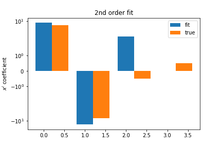
This results in higher bias but potentially lower variance.
Third Order Polynomial
The third-order polynomial fits the data well and recovers coefficients close to the true values:
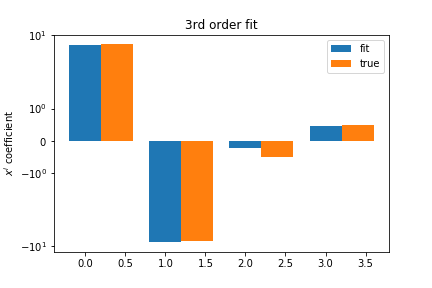
| Term | True Coefficient | Estimated Coefficient |
|---|---|---|
| \( w_0 \) | 7 | Approximate value |
| \( w_1 \) | -8 | Approximate value |
| \( w_2 \) | -0.5 | Approximate value |
| \( w_3 \) | 0.5 | Approximate value |
Tenth Order Polynomial
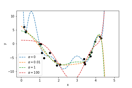
The tenth-order polynomial overfits the data:
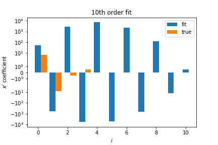
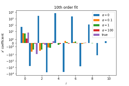
- Coefficients have very large magnitudes.
- Model captures noise in the data.
- Large cancellations between coefficients indicate overfitting.
Applying Regularisation
We modify the loss function to include the regularisation term:
\[ J_{\text{pen}}(x, y, \vec{w}, \lambda) = J(x, y, \vec{w}) + \lambda \sum_{i=0}^{k} w_i^2 \]
- \( \lambda \): Regularisation strength parameter.
This is known as Ridge Regression (L2 Regularisation).
Effect of Regularisation
With regularisation, the tenth-order polynomial coefficients have smaller magnitudes:
Choosing Regularisation Parameter
The regularisation parameter \( \lambda \) controls the strength of the penalty:
- Small \( \lambda \): Weak regularisation, model may overfit.
- Large \( \lambda \): Strong regularisation, model may underfit.
We can use techniques like cross-validation to select the optimal \( \lambda \).
Cross-Validation
When data is limited, we use cross-validation to make efficient use of it.
K-Fold Cross-Validation:
- Split the data into \( k \) equal parts (folds).
- For each fold:
- Use it as the validation set.
- Use the remaining \( k-1 \) folds as the training set.
- Average the performance across all folds.
